
Settled
Summary
‘Settled’ is a utility for international students to use at Media Design School for when they need to navigate NZ Healthcare. Having both a physical presence and an online one, Settled hopes to aid Media Design School in ensuring that their international students know where to go, who to contact and most of all, how our health system works in a quick and easy way.
It is important to note from the beginning that this is a group project. There were other parts of the project designed by my fabulous team members that won’t be featured here, these included a website, a chat bot feature and a motion graphics video. I worked on the trifold booklet and mascot design so this is what I will be showing in my portfolio.


Project Members
UX/UI Designer
Dennise Eiffel Lim & Czaranini Sagara
Photographer
Czaranini Sagara
Motion Graphics Designer
Gayle Limbu
Graphic Designer
Loretta Jade Steyn
Trifold Booklet
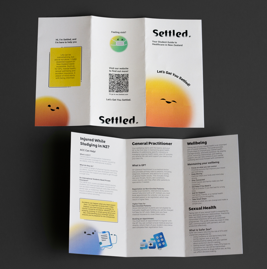
The Settled trifold booklet is an information pamphlet given out to international students on Orientation Day and welcomes them to Aotearoa, along with displaying information about the NZ Healthcare system. The booklet includes useful information about General Practitioners, Wellbeing, Accident Compensation Cooperation (ACC) and Sexual Health.


Poster
Posters will be displayed around the university campus and shown to guide students to the Settled website, where they can find out more information about healthcare and ask the Settled chatbot if they have any unanswered questions.


The Goodie Bag
Enhancing what Media Design School already has in their Orientation Day process, the trifold booklet along with three mood stickers will be added into the bag for international students. This would encourage them to take time to read about New Zealand’s medical processes, achieving to soften any anxiety about the subject. Those who can’t come to Orientation Day, the trifold booklet will be given out at reception.


Pamphlet to a Tri-fold Booklet
The trifold began as a pamphlet that was folded in a way which overlapped bookmarks leading to each section of the pamphlet. This was an interesting, interactive experience but through user testing, proved to be too difficult to navigate and unpractical. For people who aren’t English as their first language, the design was not user-friendly. Though this idea was scrapped, I valued the journey to develop it into the trifold booklet it is today. I can say confidently that this project taught me the importance of layout and readability. Depending on the context, some designs require more practical reading journeys, especially when depicting information which may otherwise be hard to understand.