
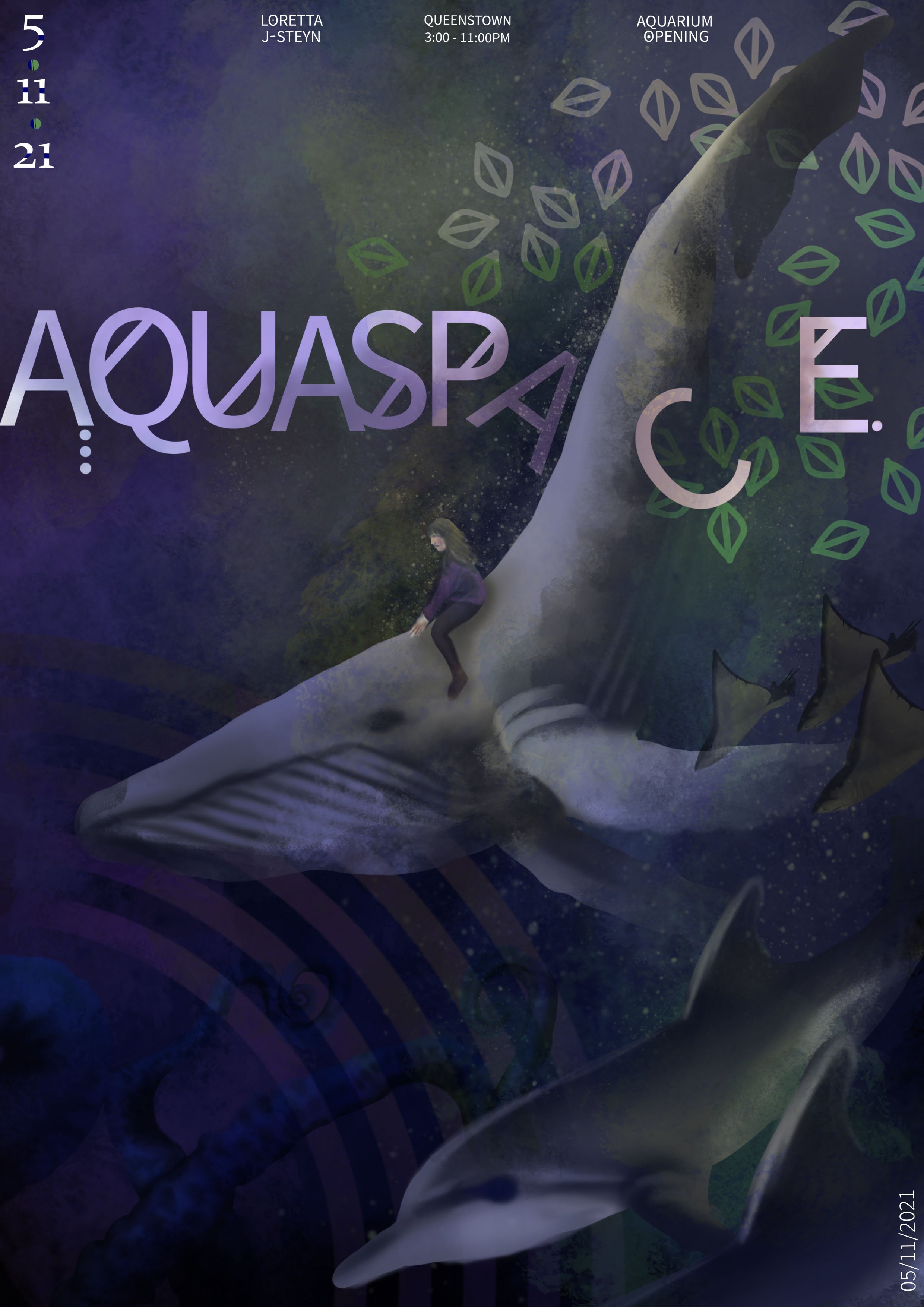
Aquaspace
Summary
Aquaspace is a long-term project that I have worked on throughout my design journey. Inspired by Sealife, Aquaspace would fund projects that help all marine life creatures, using a casual visitation marine life conservation centre as a way to raise funds and spread awareness for the ongoing struggles that marine wildlife face everyday, inside and out captivity.

Project Members
Graphic Designer
Loretta Jade Steyn
Illustrator
Loretta Jade Steyn
Posters
These posters used artist models and adapted their styles throughout the design journey. These were ; Les Graphiquants, Tifenn Python, Beatriz Milhazes, Yelena James, Jen Lobo and Nicki Foreman.


Refined Posters
These posters were featured in the yearly school coursebook in the ‘Digital Creativity Foundation’ course section. This was quite a significant step for me in terms of achievement and it inspired me further to push my project into the next step.

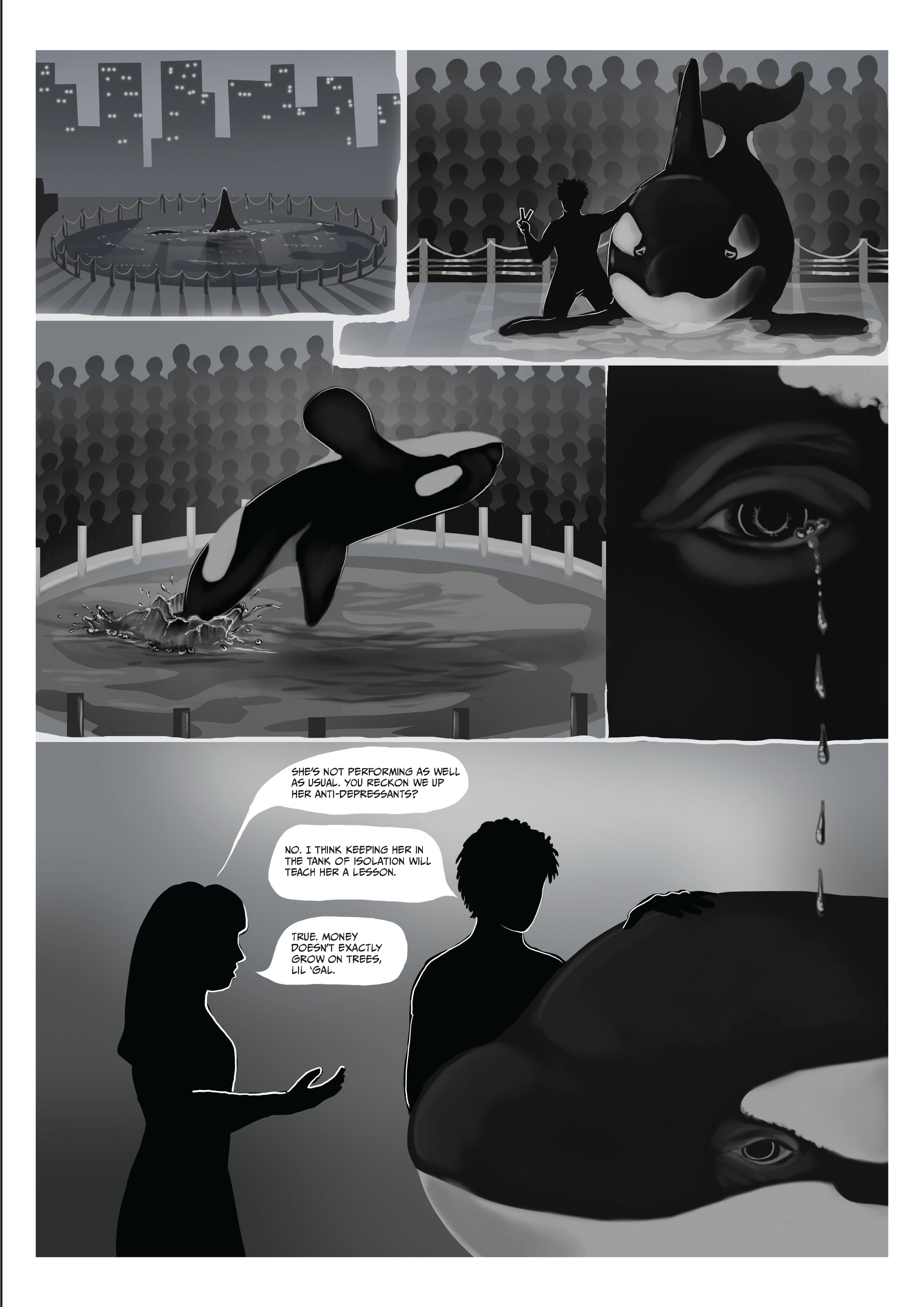
Graphic Novel
‘Reflections’ is a graphic novel, based loosely on stories like ‘Blackfish’, ‘Free Willy’ was a way to educate a younger target audience on how keeping big marine life creatures such as orcas is unfair for them, and leads to extremely detrimental issues for them in terms of health and wellbeing. It also educates readers on possible alternatives for the animals such as rehabilitation, conservation campaigns and larger enclosures.


Layout Ideation

In this part of my research, I created three possibilities for different panel layouts and styles, each depicting different levels of anticipation and/or mood. This helped me to decide on what panel style I would use. In fact, I’ve decided to use a mixture of all three! When there are scenes with more human interaction, the panels will be sharp and square-like, like in the first and second thumbnails. When Serafina is the focus of the scene, it will show more of the flowing, free forming wave-like shapes for panels. This describes her personality.
What motivated me originally to make this decision was studying famous movies which focus on their characters. I learnt that when certain characters come in, the music may change to their theme, adapting a certain tune which will subconsciously remind the viewers that this character is taking over the scene.
I experimented with two different colouring styles/palettes and found that the latter posed a vibe of happiness and joy while the first is gloomy and dark. This is exactly the setting that I want to portray when the novel begins, versus the last pages where she is released into the wild and finds that her life is free now, apposed to being caged and oppressed.

Colour Rendering
Gathering feedback via an Instagram poll which had viewers mostly between the ages of 16-24 finalised the cover of the graphic novel.


